Website Redesign
Prototypes in Figma
BACKGROUND: For many, Memory Express serves as an affordable electronics retail store that gives consumers what they need– whether it be through the products they sell, or the tech services they provide. When looking at how information architecture and user experience design principles intersect, their website at the time was outdated and overly complex.
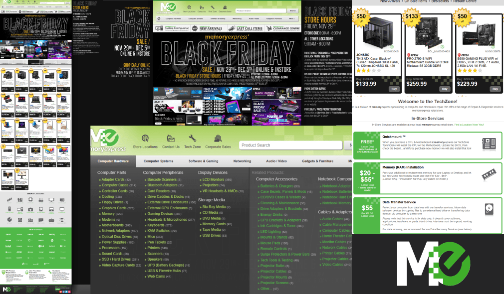
CHALLENGE: I and my team pored over the content on the existing website. We identified over 14k products that easily get lost in hundreds of levels of submenus. We identified an opportunity to simplify the user’s journey through the interface, while incorporating modern visuals and innovative predictions of user needs.

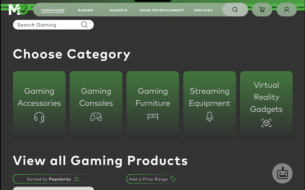
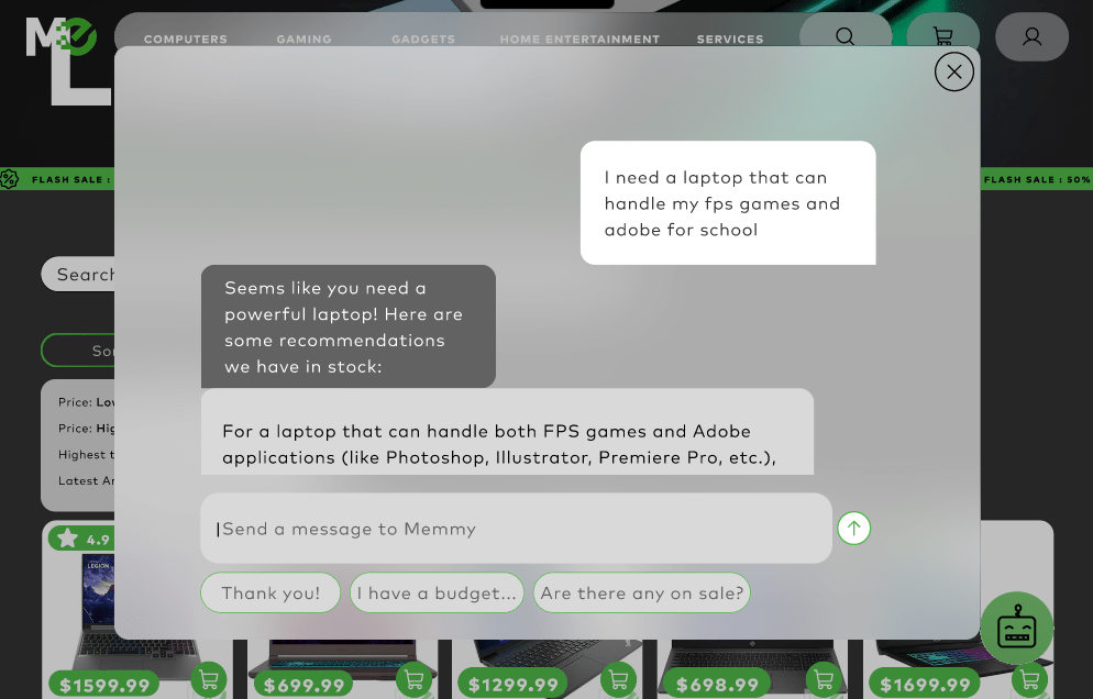
SOLUTION: The focus of our redesign was on creating a condensed catalogue that reduces user fatigue. We wanted to balance the extensive product offerings with the development of a user-centered journey. We introduced flexible navigation options, predictive search functionality, and quick access features.
RESEARCH: We did an initial evaluation of the site map and found redundancies- including empty subcategories and excessive tertiary menu options. We cut down on the extensive tertiary menu by grouping similar products, with an emphasis on consumer intuitiveness.
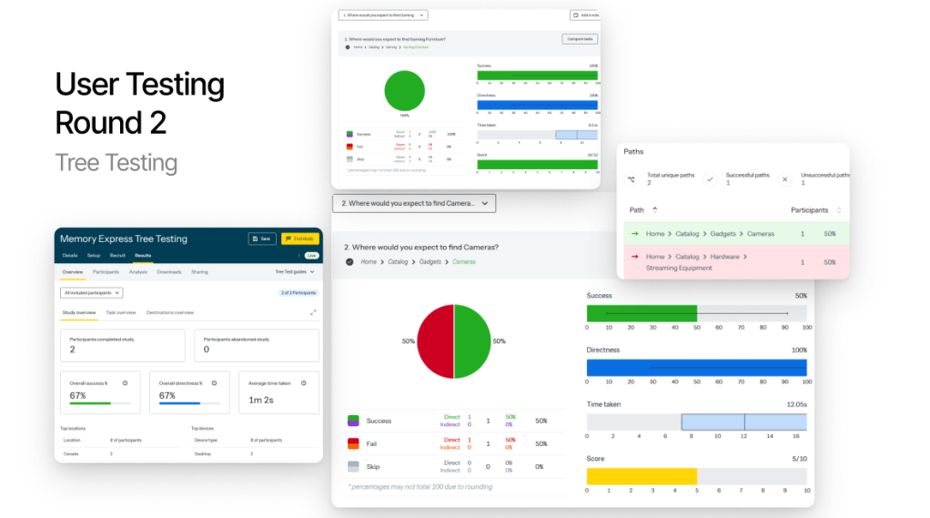
Our redesigned site map underwent many revisions, informed by card sorting and tree testing exercises, along with a comparative analysis and in-class critiques. By understanding how users navigate complex systems, we developed an optimized sitemap for Memory Express, prioritizing product categories and user flows for easier access to popular items.
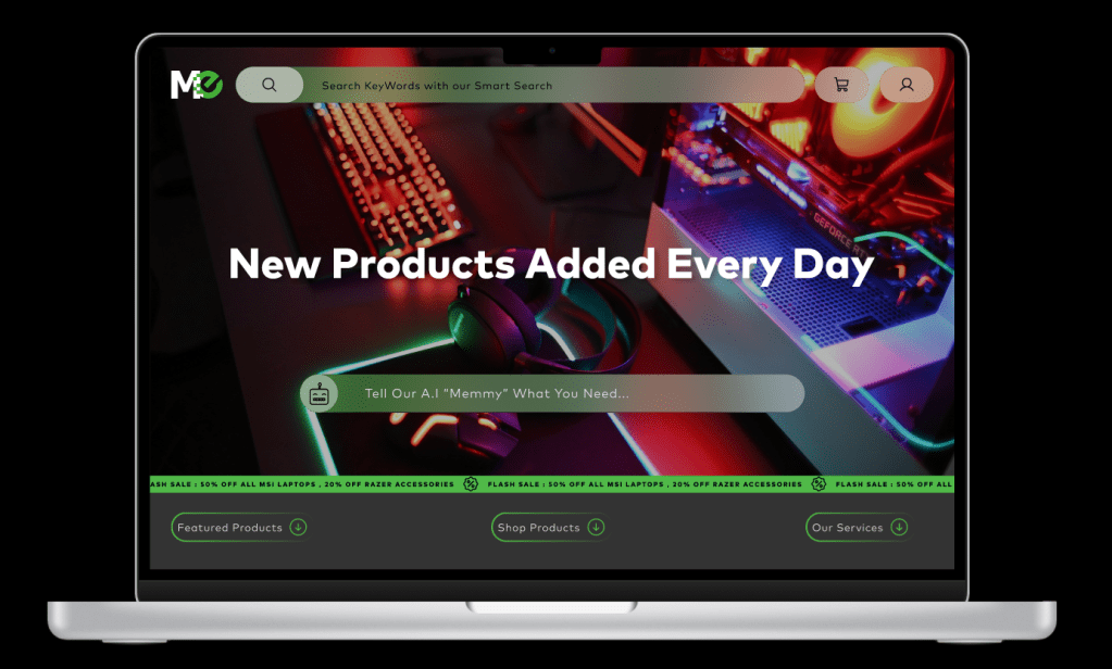
FINAL PROGRAM DESIGN: